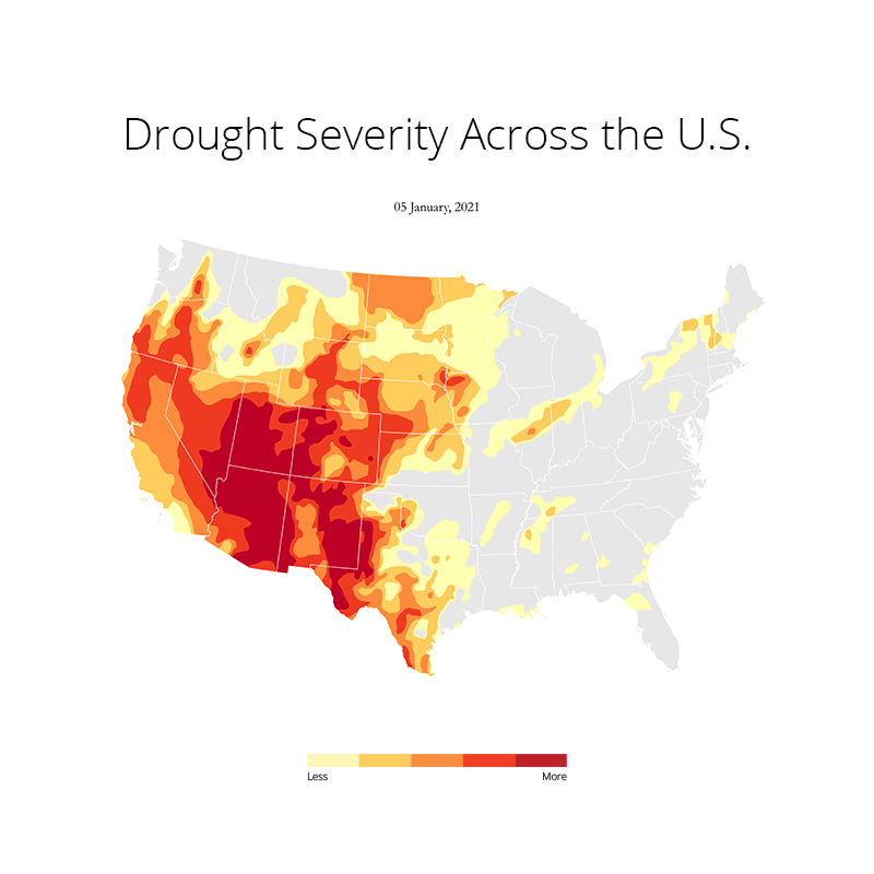
The other day when I was browising reddit, I came across this amazing visualization of the spread of drought across the U.S. As I looked for the author's citation I came to know about University of Nebraska-Lincoln's website that provided the GIS data along with other data formats. Which I found to be very convenient for me. While I found the reddit post amazing I thought I could make my own version of it that looks exactly like Mike Bostock's visualization with D3.js published in 2014 in NewYork Times. However, I wanted to use Python to achieve the same output.
At first I downloaded the 2021 drought data from here. I extracted the zip file that contained 2021's 52 week GIS data in shapefiles. The data was in terrible format. Shapefiles didn't have a column stating the dates of the layer and handling 52 seperate files seemed too much for me. So I combined all the 52 week into a single file with geopandas. Here's my notebook on github explaining how I did it. But to give you a tl;dr I just merged all 52 week into one shapefile and added two new columns, one with the layer name and the other with the date and changed the map's projection to North America Albers Equal Area Conic. You can also do it simply with QGIS's Processing Toolbox > Vector General > Merge Vector Layers or with ArcGIS. Later I made a function that plots every week of the merged layer and made a animation with Pillow that looks like this:
At first I imported all the necessary libraries that I needed for plotting this. This includes os, gc (Python's built in garbage collector library), matplotlib, pandas and geopandas. Needless to say, I used a conda environment to manage all the packages. Because installing geopandas with pip is a no no for me as it has just too many dependencies that can often throw an error due to version conflicts. Here's the README file that I created on how to set up the environment and get started.
import gc
import os
import geopandas as gpd
import matplotlib.pyplot as plt
from matplotlib.colors import ListedColormap
I imported Listed Color Mao from matplotlib.colors because I wanted to define my own color pallette that looks like Mike's map. If you're wondering how I got the hex values of each color, I just inspected the html with the dev tool on chrome and noted down the hexvalues of each color in the defined class. Here's the code that i used to define my own colormap.
colors = ['#ffffb2', '#fecc5c', '#fd8d3c', '#f03b20', '#bd0026']
my_cmap = ListedColormap(colors, 'my_colors')
I also tweaked a few default matplotlib parameter to the way I like. Like I set the figure size to 30x30 and dpi to 300 for a high quality output.
plt.rcParams['figure.figsize'] = 30, 30
plt.rcParams['figure.dpi'] = 300
Now it's time for plotting the data. The way I visualized it in my mind that the map has to have a base color on top of which the drought map will be plotted. So I downloaded a shapefile of USA from gadm to plot it as a basemap with #e7e7e7 facecolor and no edge color. Then I grouped the drought data by date since I wanted to visualized how the drought spread with time. Then I created a function that takes 3 parameters, basemap, drought and date. The function takes the basemap and plots it first and then plots the drought data of the passed date and then again basemap with no fill and white outline. The code looks like this:
usa_shape = gpd.read_file('USA Boundary/State Boundary.shp')
drought_data = gpd.read_file('./Cleaned/USDM_2020.shp')

drought_data.set_index('date', inplace=True)
date_groups = drought_data.groupby('date')

colors = ['#ffffb2', '#fecc5c', '#fd8d3c', '#f03b20', '#bd0026']
my_cmap = ListedColormap(colors, 'my_colors')

fig, ax = plt.subplots(figsize=(30, 30))

def drought_map(basemap, drought_data, date):
    ax.cla()
    ax.set_xlim(-3e6, 3e6)
    ax.set_ylim(-3e6, 3e6)
    ax.axis('off')
    usa_shape.plot(ax=ax, facecolor='#e7e7e7', edgecolor='none')
    date_groups.get_group(date).plot(ax=ax, column='DM', cmap = my_cmap)
    usa_shape.plot(ax=ax,facecolor="none", edgecolor="white")
    fig.suptitle(date, y=.7, family='Garamond', size=25)
    return fig.savefig(f"{date}.jpg")
Then I made a list of all unique dates and passed it into the function with a for loop so all the dates gets plotted. I also used garbage collector that collects unused memory from the RAM.
all_dates = drought_data.index.unique()
for date in all_dates:
  drought_map(usa_shape, drought_data, date)
  gc.collect()
I know it seems a little intimidating to see everything in a blog post so here's my Notebook that pretty much explains every step in detail and the repository that you can fork or clone and try it out on your local machine.